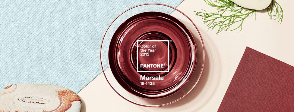
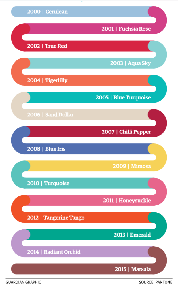
I have to start this out with complete honestly. When I first saw Marsala, I was unsure. Completely unsure. All I could think of was if this is THE color of the year then it has to be an awesome color that a lot of people would automatically love, right? And then for me the color Marsala by itself conjured up visions of Mauve and Marsala and floral prints and bad bedspreads from the 80’s. Not a good start. Not a good start at all. Then I let the idea of Marsala as the Color of the Year simmer for a day or so and started to see it all differently.
I’ve been known to say that I’ve never met a color that I didn’t like. I may not love it. But, I at least like it. I understand that colors don’t exist on an island unto themselves. They interact and play with other colors often looking and feeling completely different depending on what color it is next to. It’s all about the reflection of light and electromagnetic waves and all sorts of fun things with how our eyes work. So, I knew I didn’t hate Marsala like I don’t hate other colors. I liked it because it opens up the world of color to me. It’s another tool in my color arsenal. So, the question was, did I love it? I came to the realization that yes, I think I do! But, not for the reasons that you might think.
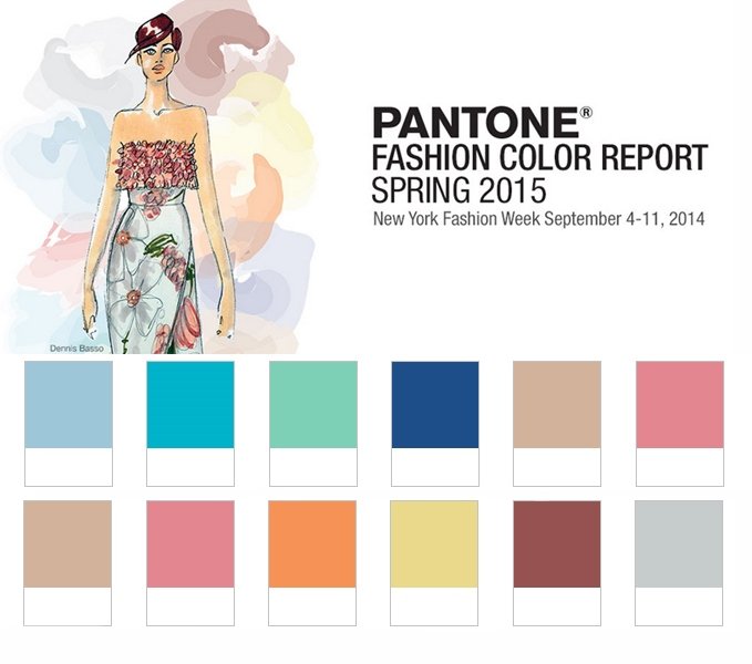
I had posted a pic the color on Instagram with the question “What do you think?” and one of my followers asked if I knew “why/how they choose the color of the year?”. The way the Pantone folks work, the release the Spring colors for the next year around Sep and one of those colors is chosen to be the color of the year. When they released the Spring Fashion report Executive Director of the Pantone Color Institute Leatrice Eiseman stated in the report “There is a growing movement to step out and create ‘quiet zones’ to disconnect from technology and unwind, giving ourselves time to stop and be still”. It was also stated that “Soft, cool hues blend with subtle warm tones to create a soothing escape from the everyday hustle and bustle.” Looking back, it helps to put the color of the year in perspective. Sorta. The vision that Pantone has for the whole year wont be shown until the beginning of the year when they show the other seasons but, just looking at the Spring palette you can see how they have chosen a pretty muted palette. But, if you look at the other colors and start to pair them with Marsala, the Color of the Year, you’ll start to see some possibilities.
There are some that equate color of the year with the economic temperature as well and if that’s the case we may be in trouble for 2015. 🙂
So back to the Color of the Year. I started to reflect on previous colors of the year. Radiant Orchard, the reigning queen of 2014 wasn’t necessarily my favorite color. I am a big fan of some shades of green but, I didn’t love the particular CMYK combo of the color Emerald that Pantone picked in 2013. Some people LOVED 2012’s Tangerine Tango but, some people really HATED it too. So, you can never please everyone, right? I didn’t love these colors in and of themselves. But for the first time, lots of shades of greens and violets and oranges are being put on consumer goods because of Pantone. Now, mind you I’m not a trend girl AT ALL. But, I do like to keep my work fresh and like to incorporate things that are ‘in’ in ways that reflect me and work with my personal style. So, I’ve always looked at color and design trends in many areas of design including fashion, interior and graphic design. It’s interesting to see the colors of the year for the past 15 years.
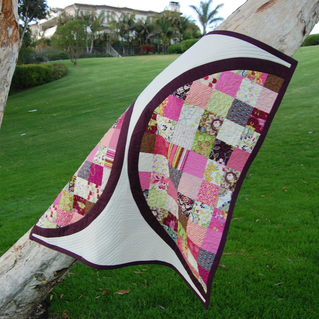
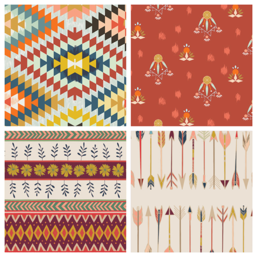
As a quilter, let’s put Pantone in perspective though. To be fair, the Pantone folks were probably not thinking about quilts. 🙂 First of all, color and design trends will hit fashion first and this is where the color of the year is already being seen. And by fashion I don’t mean what you’ll find in the department stores but, I’m talking about the runway shows. Then after that there will be a trickle down effect from there throughout all other areas of design and we might not see some of the trends in quilting and fabric until much later if ever. So, it was fun to see Maureen and April (and I’m sure other designers out there as well) be so ‘on trend’.
So, why do I love Marsala? For me as a designer and as a person that LOVES to immerse myself in color Pantone’s Color of the Year brings to the forefront colors that would normally lie in the back of the crayon box and forces me to look at colors different. And, for that I love Marsala and I love Pantone for picking it.
So, thank you Pantone. I don’t necessary look forward to the next few years seeing the marketing types slapping shades of Marsala on products just because it’s the ‘in.’ color. But, I’m really excited to see those that will really explore the nuances of the color and how it plays with the other countless colors and figure out how to make it shine in ways that it maybe hasn’t before. And, I look forward to being able to do this myself.
Now, which of you will make the first Marsala quilt of the year?! 😉 And, what do you really think of it all?

